Company details for:
DGI
DGI, Studio 12, ,
Glove Factory Studios, ,
1 Brook Lane, Holt,,
Trowbridge,
Wiltshire,
BA14 6RL,
United Kingdom
Quick Links:
Products
Brand Creation
Challenge
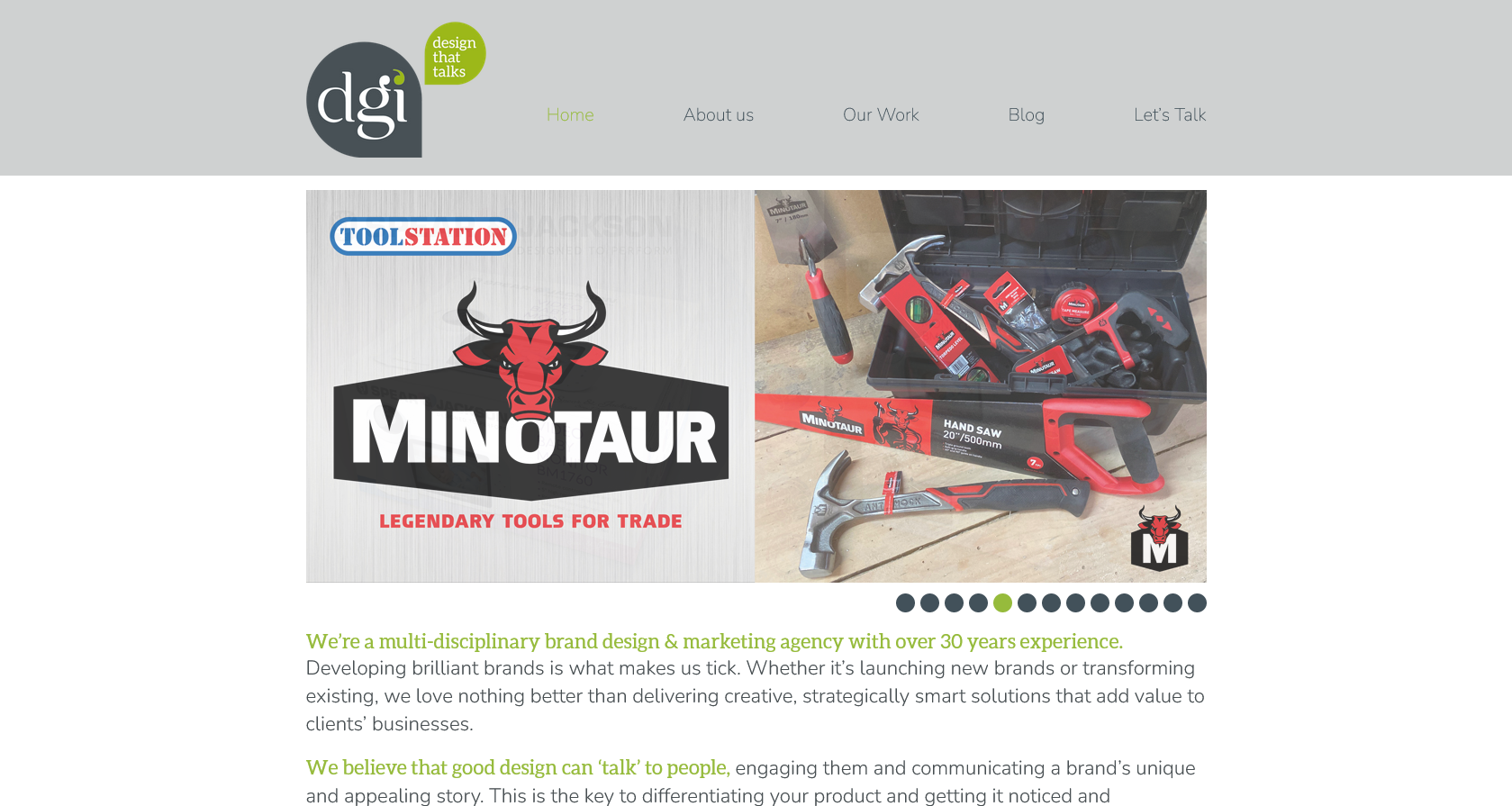
Creating brands from scratch is what we’re best at so we jumped at the opportunity to help the Toolstation team create a ‘retailer brand’ for their new range of hand tools. A Tradesman’s reputation depends on the standard of his workmanship which is directly related to the quality of his tools. So… our new brand had to be credible, reliable and strong to appeal to the target tradesman without alienating DIYers. It also had to reflect the brand positioning of expert tools at competitive prices and our brand idea ‘totally trusted by Trade’.
Solution
From our team naming exercise, we created the brand name Minotaur − a mythical creature half man and half bull which perfectly symbolises the values of toughness and strength. We developed a bold red and black identity incorporating the Minotaur head with an impactful, contemporary font. The brand is held in a narrow hexagonal shape for standout in the brochure and on the tools themselves. We also created a proposition statement ‘Legendary Tools for Trade’ to clearly communicate the brand positioning in a smart and engaging way.
Result
“DGI have delivered another fantastic result. The Minotaur name and branding is spot on for the category and the Toolstation business. It has great standout in the catalogue and online and high levels of engagement with both Trade and DIY customers. Although it’s a completely new brand, it’s already got exceptional awareness and, most importantly, we are selling more product and growing market share”.
Matt Nourse − Commercial Director, Toolstation
Packaging Design
Challenge
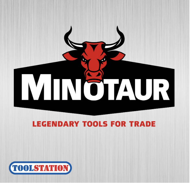
Having successfully redesigned the packaging for the Deadfast core pest categories, we were asked to design packs for the new wasp, ant and fly packaging too. Our main objective was to create a cohesive range that had standout on shelf (these products are often merchandised at the back of the store with poor lighting) and was easy for consumers to navigate and shop. In addition, as these products tend to be distress purchases, pack communication needed to be concise and effective to ensure consumers shop for the right product with high levels of confidence.
Solution
Over the last couple of years, we’ve been helping the team at Westland relaunch and expand their Deadfast range. Our new packaging for the core ranges was very successful in driving sales and increased distribution. This gave opportunities for new product development across other ‘household pest’ categories. So, using strong colour coding and the distinctive Deadfast assets we initially created, we’ve developed a cohesive range of packaging across the fly, wasp and moth products. These packs have strong impact both in-store and online and effectively segment the product ranges for easy shopper navigation.
Result
“The Pest Control category is notoriously fragmented and confusing for consumers to shop. DGI worked with us to create a comprehensive, visually consistent range of products that’s impactful on shelf and most importantly, easy to shop. The clear messaging and visual cues help consumers choose the right product with confidence in a distress purchase category.”
Head of Communications & Insight − Westland Horticulture Ltd.
Brand Identity
Challenge
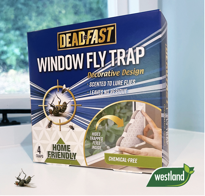
Following the success of the Hawksmoor, Minotaur and Ebb+Flo brands, the team at Toolstation asked us to refresh the Maverick safety brand.With plans to grow sales through new product ranges, the brand needed to be more distinctive and impactful with a strong positioning that appeals to Toolstation’s Trade & DIY customer base. Our design also needed a clear set of guidelines that would ensure consistency as the Maverick safety range is diverse and manufactured by a large range of suppliers globally.
Solution
Our new Maverick identity is bold and impactful with an inherent strength that conveys toughness, durability and quality. This is a key requirement in the safety wear category where high performance and effective protection cues are vital to gain the trust and loyalty of consumers. This is reinforced with our ‘Takes on Tough’ strapline that can be used across packaging, POS and comms material. The fonts are graphic and bold with a black, white and gold colour palette that has standout in the Toolstation catalogue. The chevron stripes and textured background assets make the packs and POS distinctive and immediately recognisable building loyalty as the Maverick range is extended across various product types.
Result
“DGI totally understood the scope of this brief and the new Maverick branding is a great step forward. It’s made the brand more distinctive giving it standout in store, on web and in the catalogue. The ’Takes On Tough’ strapline helps to build brand equity which in turn drives loyalty and sales. We are very pleased with the overall look and feel of the new branding both on pack and in our marketing communication.”
Greg Richardson − Head of Marketing, Toolstation
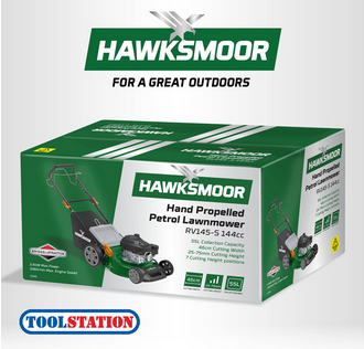
Brand Design
Challenge
There’s nothing we enjoy more than creating brands from scratch, so when Toolstation asked us to develop a brand for their new landscaping range, we jumped at the chance! Our new brand needed to work across a range of larger, higher price items including lawnmowers, but it also had to work across smaller items such as secateurs and other hand tools. The range targets Toolstation’s established base of trade customers (as well as homeowners) so needed performance, toughness and durability values as well as outdoor category cues.
Solution
We created the name ‘Hawksmoor’ which has all the toughness cues and landscape connotations we wanted for the range. This was reinforced with our brand tagline ‘For a Great Outdoors’. Then we developed the Hawksmoor identity − a graphic metallic hawk (for strength and technical values) combined with a contemporary italicised font. Pantone 349c became the ‘Hawksmoor Green’ and is used for product mouldings as well as for the packaging and identity. The packaging design template is bold, graphic and easy to replicate to ensure consistency by the various suppliers. We’ve also used iconography to communicate key features and benefits.
Result
“We have just launched the Hawksmoor landscaping range and have received some excellent feedback from our stores and customers alike. DGI answered our brief perfectly and the result is a really strong brand that has all the values we were looking for and that sits comfortably with the other Toolstation brands. Now Spring is here we’re looking forward to growing our share of the landscaping tools category.”
Greg Richardson − Head of Marketing, Toolstation

Brand Strategy & Planning
Challenge
A global auto-refinishing business, U-POL had suffered from a lack of investment and strategic direction. Despite global distribution, excellent R&D facilities and first class product formulations, the business was perceived as dated and lacking quality. We were asked by the new team to help reposition the brand based on its heritage, quality and innovation credentials.
Solution
As a starting point for the transformation, we created a premium new identity together with the strapline ‘Driving Surface Perfection’. This neatly encapsulates both the company and the brand mission. Inspired by luxury car marques, the new U-POL identity is ‘forged’ from brushed steel on a background split by a curve to reflect the perfectly smooth bodywork of a vehicle. The new identity sits proudly on all packaging and collateral bringing a quality and consistency to the range.
Result
“DGI was the clear choice of agency to partner with in meeting our brief to transform all elements of the U-Pol brand. The biggest compliment that I can pay the DGI team, is that they effectively operate as an extension of our own marketing team. They listen, challenge, and respond with urgency, to meet the pace that we are generating in our business. The feedback from our customers & the market that we operate in has been overwhelmingly positive and this is now being translated into business results.”
Chief Marketing Officer, U-POL
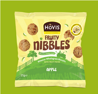
Creative Packaging Design
Challenge
We worked with Fox’s Biscuits to create a new snack product under the Hovis brand. The
packs had to reflect the ‘permissable snack’ positioning of the product. They’re a treat, but with real fruit pieces and the goodness of wholemeal flour, not such a guilty one.
Solution
We created the name, branding and packaging to communicate the products ‘healthier’ positioning and reflect the strong Hovis brand values. The sunny colours and farm imagery reinforce the Hovis heritage and real fruit photography gives taste and flavour cues. The tractor and banner device neatly tell consumers it’s the perfect ‘anytime snack’ whilst the wholemeal device reinforces the wholewheat benefits.
Result
“DGI delivered great work on this project. From quite an exploratory brief, they really grasped what we were looking to achieve and worked collaboratively to reach an end result that looks fantastic on-shelf and has clear differentiation within a cluttered category.”
Fox’s Senior Marketing Manager
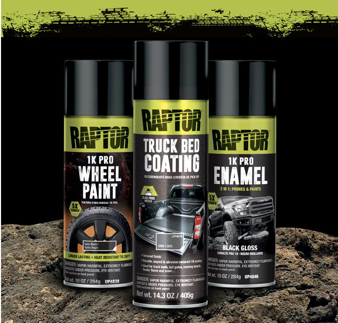
Packaging
Raptor Aerosols
Challenge
Following the roaring success of Raptor Protective Coating in the USA, our brief was to create dynamic packaging for a new range of aerosols that had all the Raptor values of toughness and performance. They needed to clearly communicate the usage areas (making them easy for consumers to shop) as well as having huge standout in a noisy cluttered category.
Solution
We combined the vibrant Raptor green with a series of bespoke key visual assets designed to demonstrate where the product is used and what job it’s for. These were created from scratch mainly through CGI rendering process. This included ‘the Raptor jeep’ which is a fully adjustable, ownable image that can be used across all Raptor communication. We utilised a font with tough visual cues to communicate performance and white on the graphite grey gives excellent standout.
Result
Result: “DGI have clearly captured the essence of the RAPTOR brand in the new aerosols range. The bold imagery clearly signposts to the consumer what the products are for and the RAPTOR green gives real standout on shelf. The reaction from retailers has been very positive and this new range successfully extends the RAPTOR brand into new product areas, and helps reinforce the brands strength in the “tough repair” category”.
Peter Hunt − Global Category Director, U-Pol
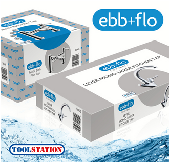
Naming, Positioning & Multi-lingual content
Challenge
We were super excited when the Toolstation team asked us to help them create a ‘retailer brand’ for their new range of own label brassware. Our objectives were to target tradesmen as well as DIYers with an accessible brand that’s functional as well as stylish. Importantly, as the Toolstation catalogue is such a key selling tool, the identity had to stand out within the catalogue environment to generate sales.
Solution
From our team naming exercises we created Ebb+Flo − a brand name with an energy and dynamism that was perfect for the category. The logo font is crisp and clean and held in a cyan lozenge for standout on the catalogue pages. The more functional, value produtcs were sub-branded ‘Contract’ and the packaging was differentiated through a plain, pale grey background. The more style-led products had a repeated brand pattern and a system of icons to communicate the key product benefits.
Result
DGI has delivered a great result for us from the Ebb+Flo naming and branding to the packaging design. Feedback from our customers has been excellent and I’m confident that with our new Ebb+Flo range we will grow our sales and share of the category as well as our profitability.
Commercial Director − Toolstation
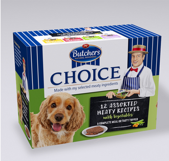
Box Packaging Design
Challenge
Butcher’s Pet Care recently asked us to redesign their Butcher’s Choice range of doggy dinners. The range lacked impact on shelf and consumers were failing to understand its premium positioning. So, our key objectives were to communicate the ‘choice’ high quality ingredients and grab consumers’ attention in the busy, crowded category.
Solution
First we bought back The Butcher making him the hero − proudly endorsing the product with his ‘Selected Meaty Ingredients’ message. Butcher’s shop cues including the stripes and chalkboard device help bring butchers shop values to the pack, reinforcing the key benefit of the high quality meaty ingredients. The alert, appealing dog engages consumers at fixture and personifies the ‘natural meaty goodness’ of Butcher’s Choice.
Result
“Our new packs have really strong standout
on fixture and we feel they do a great job in communicating the Butcher’s Choice proposition of high quality meaty ingredients. We’ve had some great feedback from our customers and we’re confident they will help
to drive sales and brand share.”
Marketing Manager, Butcher’s Pet Care
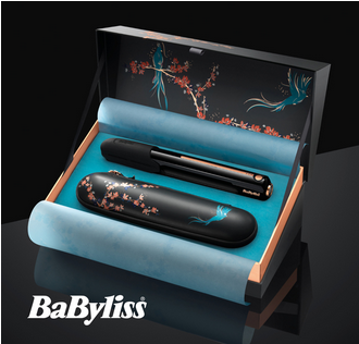
Bespoke Packaging
Challenge
Our first project with BaByliss was to create the branding and packaging for the new BaByliss 9000 Cordless Straightener. This breakthrough innovation is the ‘holy grail’ of hair straighteners delivering all the performance of electric straighteners with cordless freedom and convenience. We wanted to create step change packaging within the hair styling market that reflects the scale of innovation, engages consumers and drives brand equity through a great ‘unboxing experience’.
Solution
Working closely with BaByliss and their suppliers, we created premium packaging that’s guaranteed to ‘wow’ consumers! The BaByliss 9000 identity and luxurious box features a bespoke illustration with the bird in flight designed to communicate the key benefit of styling freedom. The blossom and branches are printed in rose gold foil which gives premium cues and reflects the trim colours of the straighteners. Purchased online, the box arrives in a beautiful teal outer carton which hints at the unboxing experience to come…
Result
BaByliss 9000 was launched on 29th August 2019 and has received outstanding reviews from consumers and influencers. The packaging has received many compliments on social media and has proven to be a key part of the offer, differentiating it from established competitors.
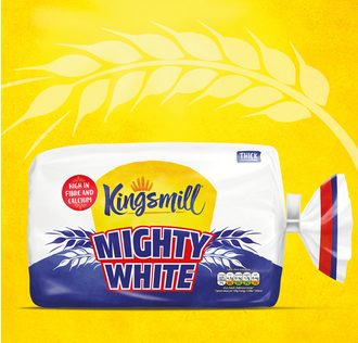
Consumer Packaging
Challenge
Mighty White bread was first launched back in the eighties (as white bread that’s high in fibre) and even now it’s still fondly remembered by those ‘of a certain age’. Being a bit of an icon, we were delighted to be asked to help rebrand it for a new generation. The Allied Bakeries team wanted a crisp, contemporary pack that retained the original red, white and blue colours and had a broad family appeal. Another key objective was to incorporate the Kingsmill identity including its signature bright yellow background − a key asset of the Kingsmill brand. Our overall aim was to create a pack with maximum visual impact in the crowded, competitive bread category.
Solution
Our new pack is strong and vibrant and uses a bold upper case font to bring Mighty White’s big personality to life! Wheat illustrations give the high fibre cues (core to the product’s positioning) and the Kingsmill logo is held in a sunny, yellow ‘mighty’ loaf shape. White is the main background colour which communicates the white bread proposition and gives standout on shelf. As the bread is often merchandised in baskets, all facings of the pack have been used including the top which carries the key product claim − great tasting white bread that’s high in fibre and calcium.
Result
“Jo and the team were a delight to work with. They understood and answered the brief with clarity, responded with pace and always on hand with helpful suggestions. The end result was true to the Kingsmill brand but drew on cues from our original Mighty White. The team was delighted with the pack stand out and overall on shelf presence. The product has been on shelf since early March and has surpassed
pre-launch sales expectations.”
Senior Brand Manager
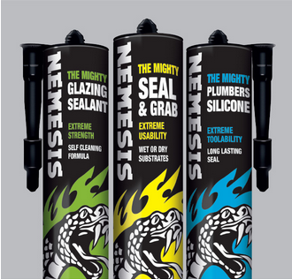
Product Packaging Design
Challenge
Screwfix briefed us to create the packaging for their premium new range of Nemesis fillers and silicones. As the new products would be displayed alongside large ranges of competitors (intent on out-claiming each other!), we had to create something that looked completely different and had standout in the Screwfix catalogue.
Solution
Our tattoo inspired Nemesis packs are designed to get noticed! Bold, confident product naming, strong colour coding and simplified communication guarantee catalogue standout and make selection
easy. The black background and serpent graphic gives strength and performance cues − key to success in this category.
Result
“DGI delivered exactly to our brief − we are thrilled with the pack design and the commercial results are already ahead of our budget.”
Director, Screwfix
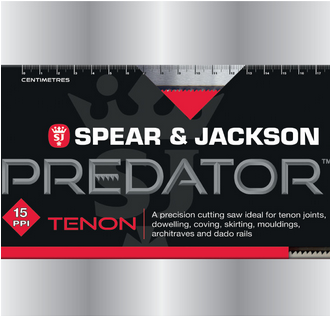
Branding & Design
Challenge
The Spear and Jackson Predator Saw packaging was not doing justice to the quality and heritage of the brand. With inconsistent branding, over colour coding and poor product communication, the range needed sharpening up!
Solution
Our bold new packs reinforce the heritage of the Spear and Jackson brand and the new Predator identity gives ‘forged steel’ quality cues. Clearer on-pack communication, the ‘teeth per inch’ window plus clear colour coding help both Trade and DIY consumers find the right saw for their task.
Result
“DGI have totally met our brief, evolving the pack to give it a more contemporary look and improving the standout of the Spear & Jackson brand and the Predator sub-brand. We’ve had some great feedback from our customers and, with much better impact in store, we’re looking forward to seeing increased sales and brand share”
Managing Director, Spear & Jackson
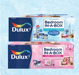
Promotional Packaging
Challenge
Dulux briefed us to create packaging, collateral and point of sale for their new Bedroom-in-a-Box concept. The idea was simple: a box containing everything needed to create a fantasy child’s bedroom. We had to ensure the pack grabbed consumers’ attention, inspiring them to undertake the project.
Solution
Our colourful boxes are fun and impactful with strong background designs that reinforce the different themes. Appealing room set photography shows the final result − a dream bedroom kids will love and parents will be proud of.
Result
“DGI have been fundamental in the successful launch of Dulux Bedroom-in-a-box. They have played a key role in the packaging design, naming and positioning of the new products, including Disney’s licensed Frozen themed Bedroom-in-a-box.”
Dulux Brand Manager

Product Campaign
Challenge
McCulloch wanted a European communication campaign for their new ROB S robotic mower that targets their key customer group − male ‘Power Performers’. The category norm is to communicate the product’s functional benefits but we wanted to create an emotive campaign that taps into the feelings associated with owning a Robotic mower. The campaign will be rolled out across the key European markets to support the Spring 2019 launch.
Solution
We identified 4 key emotional benefits of the ROB S − Freedom, Relief (from the regular chore), Pride & Satisfaction. Freedom was selected as the most appealing benefit so we developed our ‘Campaign for Real Weekends’ with the key message being that there are far more exciting things to do at the weekend than cutting the grass! Core to the campaign was a series of motivating extreme sport ads (print & digital) which were supported with consumer literature, point of sale & social media.
Result
“Our Campaign for Real Weekends perfectly captures the emotional benefits of our ROB S robotic mower which is freedom from the regular chore of cutting the grass and the fun and exciting things you can do instead at the weekend. Our competitors base their communication on the functional product benefits but we wanted to differentiate ourselves by tapping into the feelings associated with owning a Robotic mower.”
Marketing Manager
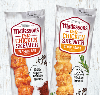
Branded Packaging
Challenge
Mattessons Strip Sticks were looking dark and dated with very little appetite appeal. Our brief was to create new packs with the fresh, healthy cues needed to target female consumers and lunchtime meal occasions.
Solution
Firstly we changed the name to Deli Chicken Skewers. This sounds much tastier and helps communicate the 100% chicken breast recipe with its healthy eating cues. The wood wash background with herbs and spices give the packs a natural, fresher feel with much more appetite appeal.
Result
“The new Chicken Skewer design perfectly address our objective of creating a fresher, tastier looking product that would appeal to a female audience. The new packs have been very well received by our customers and we’re confident we will get extended distribution as a result”
Marketing Manager, Mattessons
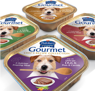
Product Label Design
Challenge
Butcher’s Petcare asked us to create new packs for their Gourmet range of posh dinners for discerning dogs. Key objectives were to complement the new structural packaging and communicate the taste values of the chef’s premium recipes (with no pampered pooches
in sight!).
Solution
Our new Butcher’s Gourmet packaging looks tasty, tempting and a cut above competitive products. The cheeky Jack Russel with his wooden spoon is engaging and communicates the appetite appeal of the chef’s special recipes. The design accentuates the unique structure of the pack with the white top giving premium cues and standout on the busy, cluttered fixture. Strong colour coding helps range navigation especially as consumers tend to shop this category on autopilot.
Result
“Our new Gourmet pack with DGI’s design is totally unique and differentiating within the crowded category. The packs have great standout on shelf and do a first class job in communicating the premium, tasty recipes in the Gourmet range. The Jack Russel is intelligent, fun and a real character, perfectly summing up the personality of a ‘Butcher’s dog’. We’ve had some excellent feedback from the Trade and the new pack has helped us to drive distribution gains”.
Gourmet Brand Manager
Literature
Challenge
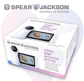
Having worked with Spear & Jackson for many years we were delighted to help them launch this iconic brand into a whole new category − S&J Tech. Their parent company is a leading global manufacturer in the home lifestyle tech market, and with the brand already performing well in new categories, the team at S&J felt it was now the time to venture into this new area. The consumer research confirmed that the target audience regarded the Spear & Jackson brand as trustworthy, credible and with high quality cues. The video monitor itself incorporates the latest technology with a whole raft of features and benefits, so… our brief was to create packaging and other collateral to reflect this technically premium positioning.
Solution
We kept the existing Spear & Jackson identity but softened it with the addition of a pastel heart. Our box design was clean and contemporary on a matt white background. The product (a high resolution render) sits proudly on the front and lid and was highlighted with a high gloss varnish. We featured a lifestyle shot on the side of the box to communicate the product key benefits − extended outdoor reach. Other features and benefits were displayed with hand drawn icons. The result is a premium ‘applesque’ pack that consumers felt portrayed all the right cues for this market.
Result
“Having worked with DGI in the past they were our first choice as creative partner to assist us in developing the brand identity and packaging within the new S&J Tech category. Their extensive experience working with top brands and expertise in creative design and packaging meant we were in safe hands, and we are delighted with the results as we now move to the launch phase of this exciting new initiative.”
Karen Abbott − Marketing Manager, Spear & Jackson
Digital Media
Challenge
Flymo asked us to help get their 2016 season off to a ‘flying’ start with new European collateral and a series of digital banner ads for use in the various markets. Key objectives were to drive the brand proposition of ‘Easier by Design’ whilst showcasing their range of lawnmowers and other product categories.
Solution
Our eye-catching animated banner ads feature various Flymo products with a strapline that reinforces their promise of speed as well as ease. New European product literature helps consumers choose the right lawn mower for their garden by clearly differentiating between the models. Key design features and convenience benefits are neatly summarised through imagery
and iconography.
Result
“DGI’s strategic approach to our collateral
has delivered informative brochures that differentiate the products in our range making it much easier for consumers to navigate. The key benefits are clearly communicated and indicate the value added features across our range of products. Feedback from our customers and consumers has been exceptionally positive.”
Marketing Manager Retail, Flymo
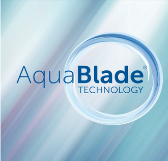
Branded Campaign & Video Production
Challenge
Ideal Standard wanted a new identity and communication materials for their revolutionary new AcquaBlade flush technology − the most significant innovation since the invention of the flush toilet! Our branding and trade collateral had to effectively communicate the features and benefits (as well as the stylish design credentials) to a diverse audience including architects, building contractors and interior designers. The instore POS had to appeal to shoppers encouraging them to trade up to the new product.
Solution
The AcquaBlade identity sits with the Ideal Standard master brand identity and hints at AcquaBlade’s cyclonic water flow pattern. The website and collateral are consistent in tone/style and used key graphics to clearly communicate the features and benefits of the technology. Our collateral for the European markets appealed to all professional audiences receiving excellent feedback from key customers. The POS (rolled out in B&Q stores) tells the Aquablade story and clearly communicates the revolutionary new technology and superior flush performance.
Result
“DGI worked closely with the European team to deliver a consistent and comprehensive package of support that ensured an impactful and highly successful AquaBlade launch at ISH. Our displays in B&Q have been particularly successful, raising awareness of Aquablade with consumers and explaining all the features and benefits of our new innovation”.
Marketing Director − Europe
Point of Sale
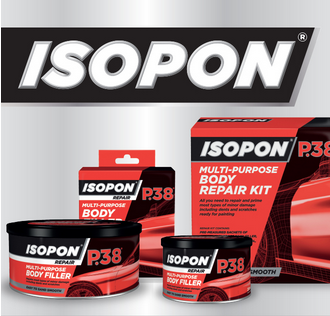
Challenge
The Isopon brand had a core group of loyal followers (car enthusiasts) so our challenge was to develop new packaging that would reposition the brand, updating it and making it salient with a wider group of consumers. Our key objective was to communicate the usage area, key benefits and ease of use to novice consumers who had never undertaken a car repair before.
Solution
We segmented the range into Repair, Prime and Protect, making it easier for consumers to navigate and encouraging a system approach. The wire frame car device along with strong colour coding is used across the range to communicate the usage areas of the products. This is also used on the website and other communication materials and has become a strong, recognisable Isopon asset.
Result
“Our new Isopon packs have transformed the range, contemporising it and making it accessible to a whole new target consumer group. The standout is excellent and we’ve had some extremely positive comments from our customers both in the UK and in America. We’re looking forward to welcoming a new generation of younger consumers to our brand.”
Global Brand Director, U-POL
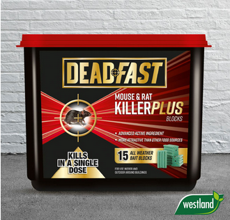
Brand & Packaging Design
Challenge
Leading horticultural brand Westland wanted to grow their share of the rodenticides category with the launch of a technically superior, innovative range of products. We were asked to create new packaging that communicated this positioning and had standout in the fragmented, cluttered category. Most importantly, the packs had to give total reassurance that the products would do the job − this is definitely one category where consumer confidence is key to the purchase decision.
Solution
Our new black and gold Deadfast identity immediately gives the packs premium and strength cues as well as impact on the cluttered fixture. The target device is a strong brand asset that is integrated into the identity and also used as key design element on pack. It visually communicates the deadly efficacy of the products and is reinforced by our ‘Dead Fast…Dead Certain’ strapline. Strong colour coding increases standout and helps consumers navigate the range selecting from chemical, mechanical, electronic or humane options.
Result
“DGI have created a range of packs which perfectly meet our brief. They look premium versus the competition and effectively communicate the innovative product formulations and trap designs. The messaging is very clear making it easy for shoppers to quickly navigate through the range − so important in this low frequency, distress purchase category.
Brand Manager Lawn Care & Controls
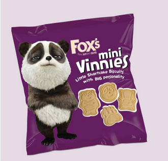
FMCG Packaging Design
Challenge
Fox’s asked us to develop the name and packaging for a new children’s biscuit launch.
Our objective was to create a pack that would engage both kids and parents alike and have maximum impact in the very cluttered, noisy children’s biscuit category.
Solution
As the biscuit shapes were based on Vinnie (the iconic brand panda) we made him the hero, naming the biscuits ‘Mini Vinnies’ and featuring him proudly on the front of the pack. We also created a series of playground puzzles to engage kids and encourage them to collect the packs. The end result is a pack that’s unmistakably owned by Vinnie and loved by kids of all ages.
Result
“DGI totally met our brief delivering a witty, engaging pack that really captures Vinnie’s personality. The black, white and purple packs have excellent standout in one of our busiest categories and feedback from the Trade has been absolutely fantastic!”
Fox’s Marketing Manager
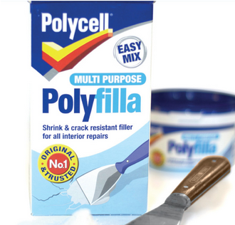
Graphic Design & Print
Challenge
The Polycell product range had ‘evolved’ and lost consistency. Polycell wanted to relaunch their entire range with a coherent look across the various products and pack shapes with the key objective of making the range easier to navigate and helping consumers to select the correct product for their task.
Solution
Our packaging for Polycell fillers and sealers gives the range a coherent look regardless of the type and shape of the pack. Strong colour coding, simple graphics and a key benefit icon help shoppers navigate the complex
product range.
Result
“We can always rely on DGI to deliver a great creative solution that answers our brief. Our new Polycell packaging scored the highest ever results in consumer research so we’re confident it will move the brand on enormously. The designs have been really well received by our customers who are using them as a benchmark for other products in the category”.
Polycell Senior Marketing Manager
Photography & Packaging
Challenge
UPOL asked us to create a sub-brand identity and packaging for their breakthrough Rapid System which offers significantly faster curing times versus the competition. As part of the overall U-POL rebranding project, the packs had to look technically superior versus the rest of the portfolio and communicate the key benefits at a glance. We also supported the launch with communication material and collateral.
Solution
Our metallic silver tins with rich colour coding give technical cues and reflect the premium positioning of the product. The speedometer is a Rapid System asset that is used across all communication material to differentiate the range. We also developed a series of ‘at a glance’ icons to help body shop staff select the correct product for their task.
Result
“The launch of the Rapid System was critically important to the future development of U-POL and the new packaging has been a key factor in its highly successful launch. It met our brief perfectly and really helps to elevate the U-POL brand in terms of quality and innovation credentials. The brochure and other collateral has done a great job in communicating its benefits to the market to build awareness and gain trial.”
Global Category Director, U-POL
About us
We Specialise in:
- Brand Creation
- Packaging Design
- Brand Identity
- Brand Strategy & Planning
- Naming & Positioning
- Point of Sale
- Brand Communication
- Digital Media
Brand Creation
Creating new brands and launching new products is what we love to do. Our first step is to create appealing concepts that differentiate ourselves from the competition with strong positioning. Once the name and proposition have been selected, we create marketing materials that will attract the target audience.
Packaging Design
The development of top-notch packaging is what makes us tick! In today's competitive in-store environment, we'll ensure your brands always catch the consumers' attention on-shelf.
Brand Strategy and Planning
Using our expertise, we'll determine what your target consumers want and need. Our team can then help you develop (or fine-tune) your brand's positioning and plan your product portfolio accordingly. As well as creating awareness and encouraging consideration, we are also capable of suggesting effective communication strategies.
Brand Communication
Your brand can communicate effectively at every touchpoint with your consumers with the help of our team. Media such as digital, point-of-sale, literature, advertising, and sales support materials are included in this category. Our team can also design and build websites and create content that will engage your consumers.
How we work…
Our core value is 'creativity that gets results', and we'll always go the extra mile to help you achieve your business objectives...
In order to ensure everyone in the team is on the same page with the commercial challenge, we always spend time 'upfront' understanding a client's business, category, and consumers.
All projects, regardless of size or budget, are overseen by the senior team.
We are able to handle those quick turnaround projects that many others would find impossible, knowing how fast things move today.
It is our firm belief that this partnership approach delivers the best results.