Take crafty product photos that bag the sale
16 July 2024
Blood, sweat, tears – these are the ingredients of every handmade product you’ve created. Your product images should showcase each meticulous stitch, brush, fold or bead. Here’s our non-nonsense walkthrough for stunning images of your creations (that boost sales and grow fanbases).
 Blood, sweat, tears – these are the ingredients of every handmade product you’ve created. Your product images should showcase each meticulous stitch, brush, fold or bead. Here’s our non-nonsense walkthrough for stunning images of your creations (that boost sales and grow fanbases).
Firm foundations
Avoid filters and effects – go simple and clean
Forget borders, filters and fancy effects. After all, you’ve poured copious amounts of creativity into your product, why would you want to detract from it now? What’s more if you use photo effects, your buyers may feel as though they’ve received a product that looks different to what they thought they were buying.
Your product images should be sharp, clean and consistent. They should also represent the true colours of your products (any decent spec smartphone should have you covered – you should be looking for a minimum of 8 megapixels).
Kraft Space Pro Tip: Remember – many online shops will display your photos as cropped squares in the search or category view, so be sure to leave adequate room surrounding each product to keep your product fully visible.
Creating and Communicating Your Branding Through Imagery
Settle on your signature style
What’s your style? If you were to sum up your products in a few words, what would they be? Rustic? Eccentric? Vintage? Industrial? Retro?
Kraft Space Pro Tip: Once you’ve nailed down your signature style in a few words, print them out and constantly refer back to them as you choose each element of your photoshoots (from your backdrops to your props).
Switch up your style as the season’s change
Whatever your product – be it a cushion or clothing – you want it to end up in someone’s home, so demonstrate it within changing, seasonal settings.
Easy to introduce props include seasonal flowers, darker backdrops for winter and lighter for spring and summer. Here are some ideas for your inspiration…
- Spring: flowers, butterflies, grass
- Winter/Christmas: Pine needles, tartan, dark wood, snowflakes
- Summer: Bright colours, fresh flowers
- Autumn: Orange leaves, freshly picked veg, pumpkins
Setting the Scene – Backdrops, Props and Staging
Choose a beautiful (complimentary but not distracting) backdrop
First and foremost, you’ll need a good level of natural light, so consider a photoshoot by a large window at around midday (standard home lighting simply isn’t powerful enough for a pro-look photoshoot).
Your backdrops should be minimal, neutral and clean, and should also align with the style of your handmade creation (so if your design-direction is traditional and twee, a contemporary setting is simply not going to cut it).
Some simple but effective backdrop ideas include: a solid black background; tiles; marble, stone or wood-effect paper; brightly-coloured texturised card or a wooden, textured table set against a window.
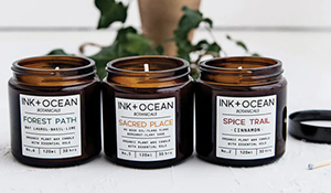
Kraft Space Pro Tip: Think about showing your product in action – if you create handmade dinner plates, lay a beautiful table; if you make plant based candles, set the tone with some surrounding foliage.
Be inspired and step into the shoes of a set designer
Props should complement and enhance your product. But this takes time, practice and masses of inspiring photos from interior design magazines and Pinterest product images.
Creating Context
Reflect elements of your products in your photo theming
Think about the textures and how you can reflect key features of your product in its surroundings. Do your products focus on a subject matter of nature? Then introduce a potted plant and woodgrain in the form of a table or frame.
Whatever you place into the picture with your products, inspect with a meticulous eye. Do they introduce unnecessary reflection or glare (such as metal and glass can?).
Kraft Space Pro Tip: If you use colour within your props, does it draw out the colour in your product, or make it fade away? Introducing one or two accent colours from your design can be effective, but only when approached with caution.
Make it beautifully obvious what your product is perfect for
If some of your items are designed exclusively for children, consider a photoshoot with small hands or images that show a kiddy wearing your product.
Does it have functional features that may not be immediately apparent (such as a bag that has a phone compartment or jump with inner pockets) then take some close up shots showing the features.
As it’s handmade, you could also consider staging the backdrop with a few of the raw materials or tools you’ve used.
Other Press Releases By This Company
- 26/11/2024 - 10 Handmade Christmas Gifts To Make And Sell
- 17/09/2024 - How To Make And Sell Your Own Exfoliating Body Scrub?
- 27/08/2024 - Attract Your Customers: 10 Product Photography Ideas
- 31/07/2024 - Preserve Your Wedding Bouquet: How To Dry Them?
- 29/07/2024 - 10 Inspiring Guides To Package Handmade Jewellery
- 25/07/2024 - 10 Most Profitable Trending Crafts To Make & Sell
- 24/07/2024 - 5 Reasons Why Handmade Crafts Are The Perfect Gift Idea
- 24/07/2024 - Beginner's Guide: How to Make Handmade Soap with Simple Steps
- 19/07/2024 - 5 Reasons Why Buying Handmade Is Better
- 18/07/2024 - How To Start A Handmade Jewellery Business From Home
- 17/07/2024 - How to run a successful craft business
- 16/07/2024 - Five steps to a hustling, bustling craft fair stall


